Welcome to our brand guidelines
Version 1.0
This is a living resource that will evolve as our brand grows.
Here, you will find guidance on how to bring our communications to life with both flexibility and consistency.

01. Brand foundations
A comprehensive brand strategy is more than just a plan; it's a powerful tool that helps us create a strong brand identity that resonates with our target audience.
This strategy is designed to differentiate NovaTaste from our competitors and help create communications that increase brand awareness and build customer loyalty.
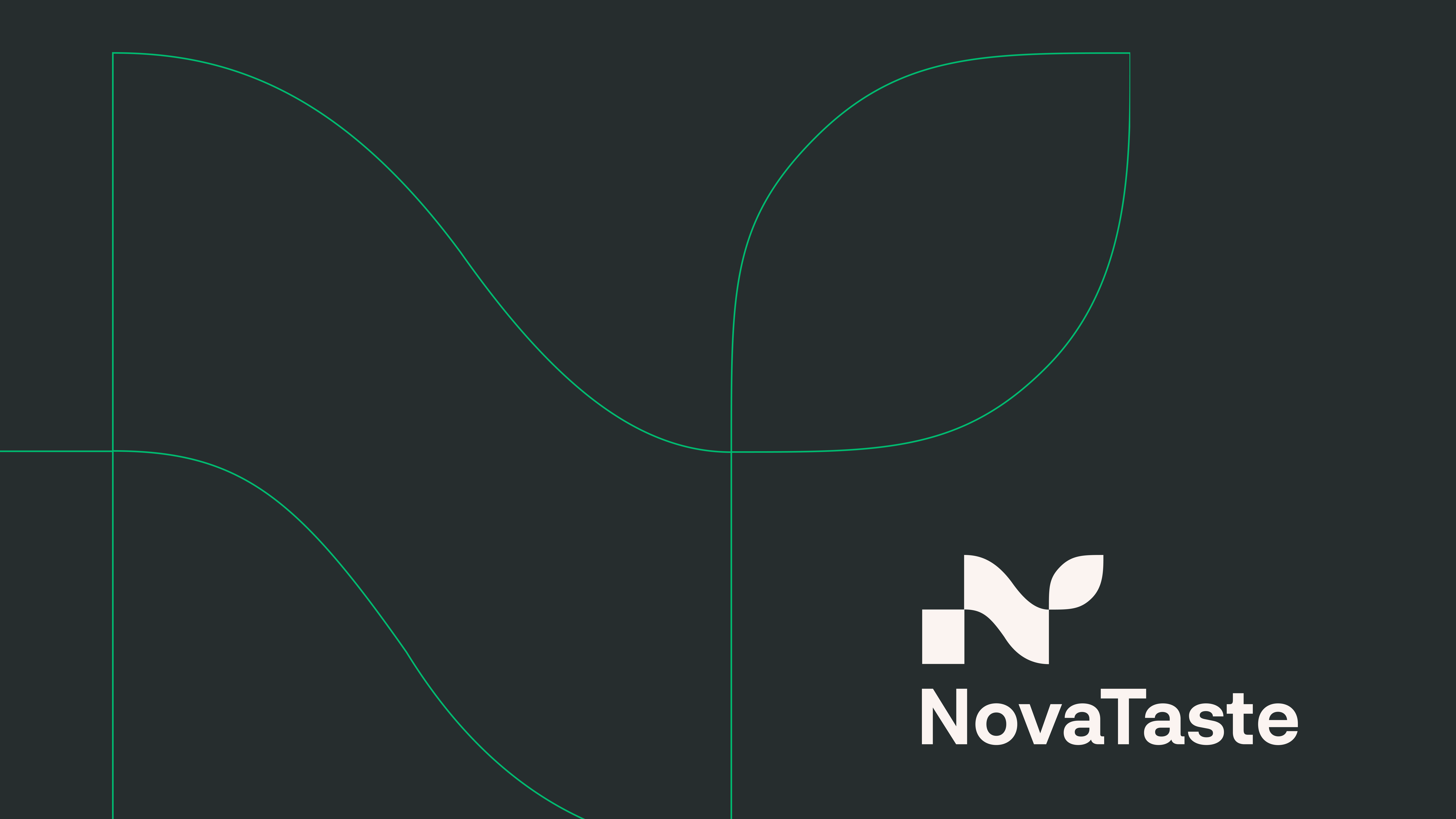
NovaTaste brand
Our brand vision and mission are essential components of our brand strategy.
The brand vision outlines the long-term aspirations and goals of our brand, while the mission describes how we will achieve these goals and create value for our customers.
Vision – Our place in the world.
To revolutionise the way that the world experiences food.
We are working to create unforgettable taste sensations that enrich people's lives with unparalleled joy and delight.
Mission – What we are working to achieve.
To provide comprehensive taste solutions.
We enhance the quality of our customers' products, across the
full-spectrum of flavours, tastes, smells, textures and culinary application.
Our solutions deliver results that are both innovative and unrivalled in their excellence.
Strategy – How we will go about it.
Our strategy is to provide an end-to-end solution that empowers our customers from ideation to delivery.
We pride ourselves on our ability to stay ahead in a market that is always evolving.
By harnessing our global expertise in taste, we design, manufacture, and optimise solutions that enable our customers to retain market leadership.
Our values
Our values guide how we show up to work each day.
It’s what we should expect from ourselves and each other.
We care.
We respect people & planet through sustainable, safe, and inclusive actions.
We own what we do.
We stay ahead by owning our issues,
challenging the status quo and seeking excellence in everything
we do.
We do what’s right.
We take responsibility for our actions. We do what we say. Not because it’s easy, but because it is right!
We bring value.
We are close to our customers to provide the right solutions. We are their creative, innovative partner.
We win together.
We go further together. We collaborate on shared goals, making any success a team success.
Our personality
Our brand communications should reflect our personality.
We are
Innovative
Trusted
Sustainable
Passionate
We are not
Unfocused
We are intentionally precise in where we invest research.
Unreliable
We demonstrate reliability and consistency over time to earn trust.
Trend chasers
We are committed to responsible sustainability and act with integrity in our actions.
Fanatical
We are not idealistic. We remain down to earth and realistic in our solutions.
Brand strategy
A summary of our brand strategy.

02. Visual identity
Each element within our visual identity plays a specific role. Collectively these elements connect to our overarching design approach – simple by design, joyful by attitude.
Logotype
Logotype
This is our primary logo.
Please treat with care!
Only use the logotype and lockup in its original colours.
Minimum size
Digital usage: 50px
Print usage: 12mm
Clear space
Ensure there's enough clear space around the logotype to boost its visual impact.
Minimum clear space should be at least equal to the leaf shape.
Brand portfolio
Portfolio brand lock-ups
When referencing NovaTaste with
in our brand portfolio logos, the copy "by NovaTaste" should be set in Neurial and aligned to the bottom right.
Logotype digital shorthand
We use a shorthand version of our logomark on all social media icons and website favicons.
It should be represented by the simple leaf device.
Do not:
Use the full logotype as the favicon.

Colour
Salt
Hex FBF4F1
RGB 251 244 241
CMYK 1 6 6 0
Pantone Coated Warm Gray 1 C
Pantone Uncoated Warm Gray 1 U
Black Pepper
Hex 262D2E
RGB 38 45 46
CMYK 78 60 58 69
Pantone Coated 4287 C
Pantone Uncoated 419 U

Mint
Hex 1FBD73
RGB 31 189 115
CMYK 81 0 74 0
Pantone Coated 7480 C
Pantone Uncoated 2420 U

Turmeric
Hex E4B33D
RGB 228 179 61
CMYK 7 33 96 0
Pantone Coated 7409 C
Pantone Uncoated 7406 U

Tangerine
Hex ED7932
RGB 237 121 50
CMYK 0 66 93 0
Pantone Coated 1585 C
Pantone Uncoated 1505 U

Paprika
Hex AB2E26
RGB 171 46 38
CMYK 18 99 96 9
Pantone Coated 3516 C
Pantone Uncoated 2028 C

Açaí
Hex 850026
RGB 133 0 38
CMYK 25 100 73 31
Pantone Coated 207 C
Pantone Uncoated 3517 U

Himalayan Salt
Hex F6CED4
RGB 246 206 212
CMYK 0 28 9 0
Pantone Coated 706 C
Pantone Uncoated 7422 U

Plum
Hex 84628B
RGB 132 98 139
CMYK 53 67 20 4
Pantone Coated 667 C
Pantone Uncoated 7679 U

Cavolo Nero
Hex 12402A
RGB 18 64 42
CMYK 96 44 88 56
Pantone Coated 7483 C
Pantone Uncoated 2427 U
Accessibility
When using colour on digital applications, please ensure you test the contrast ratios and always aim for WCAG AAA standards.
Follow these colour combinations to ensure accurate colour contrast accessibility.

Typography
Typography
We use Neurial Grotesk as our primary brand typeface.
It is a Swiss style modernist sans serif font characterised by the play between elegant rounded shapes and sharp angular details.
Neurial Grotesk was carefully selected for its similarities to the shapes of the logo.

Condensed typeface
Arial Condensed can be used for packaging or labels where lots of information needs to be presented in a condensed form.
Do not:
- Use on any main brand communications.

Fallback typeface
When our brand font is not available Arial can be used - This font should only be used on internal business communications.
Arial is readily available on most computer operating systems.
Do not:
- Use any other fonts as alternatives for our brand fonts;
- Use on external communications.

Photography
Abundance of taste
We aim to focus on the individual ingredients and celebrate the vibrant diversity and inherent richness found in each component of our culinary creations.
Through striking visual compositions, we will accentuate the beauty of singular ingredients, presenting them in large quantities that overflow with their natural colours and flavours.

Focus on food
Highlight food on a plate and capture the essence of culinary delight through visually captivating images.
Show plates of food or mouth-watering detailed close-ups, where the dish is the star of the show. Highlight how delicious the food is through the use of vivid colours, high contrasting and glistening images.

Chefs preparing food
Show the process of making food. Close-up details of food making, seasoning or adding the final touch to the dish.

Behind the scenes
Show the expertise and technical know-how of taste solution development, from the lab, the test kitchen or the production line.
Do not:
Never show clearly staged, clichés or stereotypically looking stock imagery. Always pick natural looking photos.

The enjoyment of food
Highlight the enjoyment of food by capturing the pure joy and pleasure people experience while indulging in delicious food.
Through candid moments and genuine smiles, we aim to convey the shared delight that comes from savouring a delectable meal.
Do not:
Never use photos that look clearly staged and never show people looking straight into the camera. Always show people in natural scenarios, as captured authentic moments.

Brand element
Creative use
Using the shapes of the logo we can continue a NovaTaste narrative by applying a unique treatment to imagery or creating a background graphic.

03. Brand showcase
An inspirational gallery of brand applications and activations.


Presentations
A PowerPoint template and a suite of icons have been created for our communications. Use the links below to download them and elevate your presentations.

